1.141.932
kiadvánnyal nyújtjuk Magyarország legnagyobb antikvár könyv-kínálatát

Responsive Design: Patterns and Principles


New York
| Kiadó: | A Book Apart |
|---|---|
| Kiadás helye: | New York |
| Kiadás éve: | |
| Kötés típusa: | Ragasztott papírkötés |
| Oldalszám: | 160 oldal |
| Sorozatcím: | A Book Apart-Brief Books for People Who Make Websites |
| Kötetszám: | 15 |
| Nyelv: | Angol |
| Méret: | 22 cm x 14 cm |
| ISBN: | 978-1-9375573-3-1 |
| Megjegyzés: | Fekete-fehér és színes ábrákkal, fotókkal. |
Értesítőt kérek a kiadóról
Értesítőt kérek a sorozatról
A beállítást mentettük,
naponta értesítjük a beérkező friss
kiadványokról
naponta értesítjük a beérkező friss
kiadványokról
A beállítást mentettük,
naponta értesítjük a beérkező friss
kiadványokról
naponta értesítjük a beérkező friss
kiadványokról
Előszó
Tovább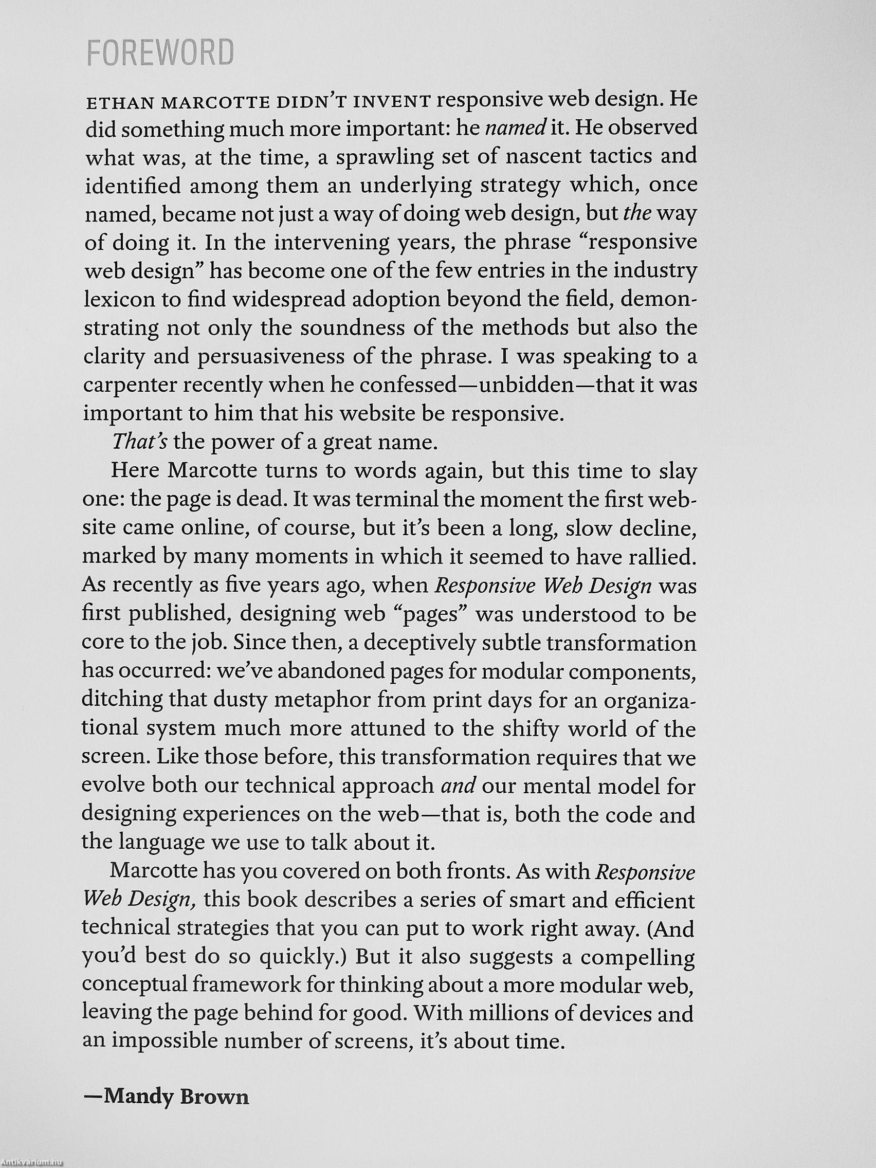
Fülszöveg
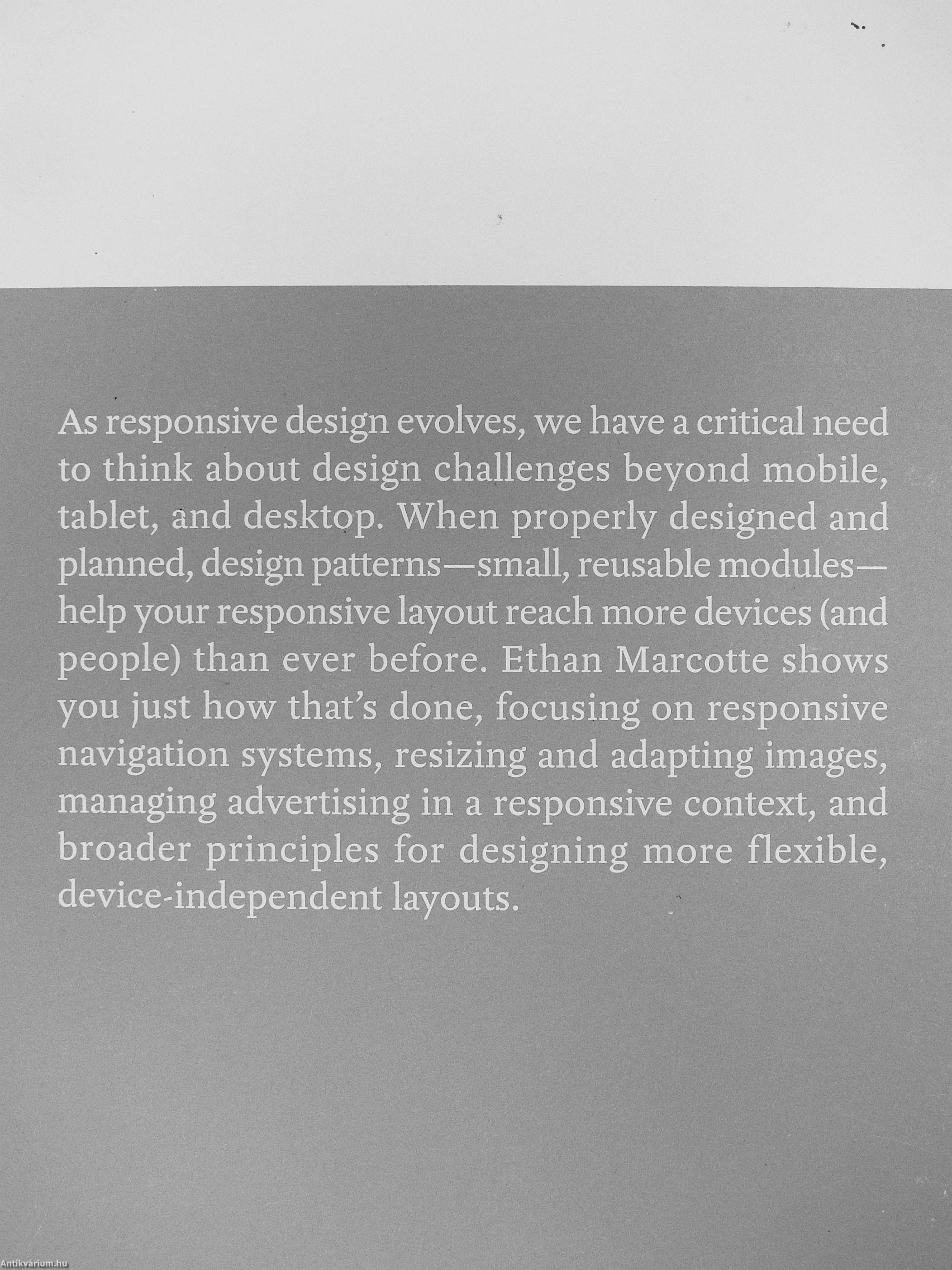
As responsive design evolves, we have a critical need to think about design challenges beyond mobile, tablet, and desktop. When properly designed and planned, design patterns—small, reusable modules-help your responsive layout reach more devices (and people) than ever before. Ethan Marcotte shows you just how that's done, focusing on responsive navigation systems, resizing and adapting images, managing advertising in a responsive context, and broader principles for designing more flexible, device-independent layouts. wmSM
Témakörök
- Idegennyelv > Idegennyelvű könyvek > Angol > Műszaki
- Műszaki > Informatika > Számítógép > Programozása
- Műszaki > Informatika > Internet
- Műszaki > Idegennyelv > Angol


Ethan Marcotte
Ethan Marcotte műveinek az Antikvarium.hu-n kapható vagy előjegyezhető listáját itt tekintheti meg: Ethan Marcotte könyvek, művekMegvásárolható példányok
Állapotfotók


A gerinc kopott.
Állapot:
Jó
4.980 ,-Ft
25
pont kapható
Kosárba
 Folytatás Microsoft-tal